MediNav Kiosk
Interactive Digital Navigation
In healthcare environments, clear navigation is critical for both patient care and operational efficiency. Research revealed that 70% of hospital visitors missed existing wayfinding kiosks and staff spent up to 40% of their time giving directions.
We redesigned the MediNav Kiosk - replacing a text-heavy interface with an intuitive, map-centered experience. Resulting in a significant reduction in navigation confusion and an estimated $3.5M annual savings in recovered efficiency.

Company
Connexient
(Everbridge)
Objective
To help diverse hospital visitors navigate confidently while reducing operational inefficiencies and improving patient outcomes.
My Role
Product Designer responsible for UX research, ideation, wireframing, prototyping, testing & design QA
Timeline
Problem
Research & Discovery
Key Insights & Design Decisions
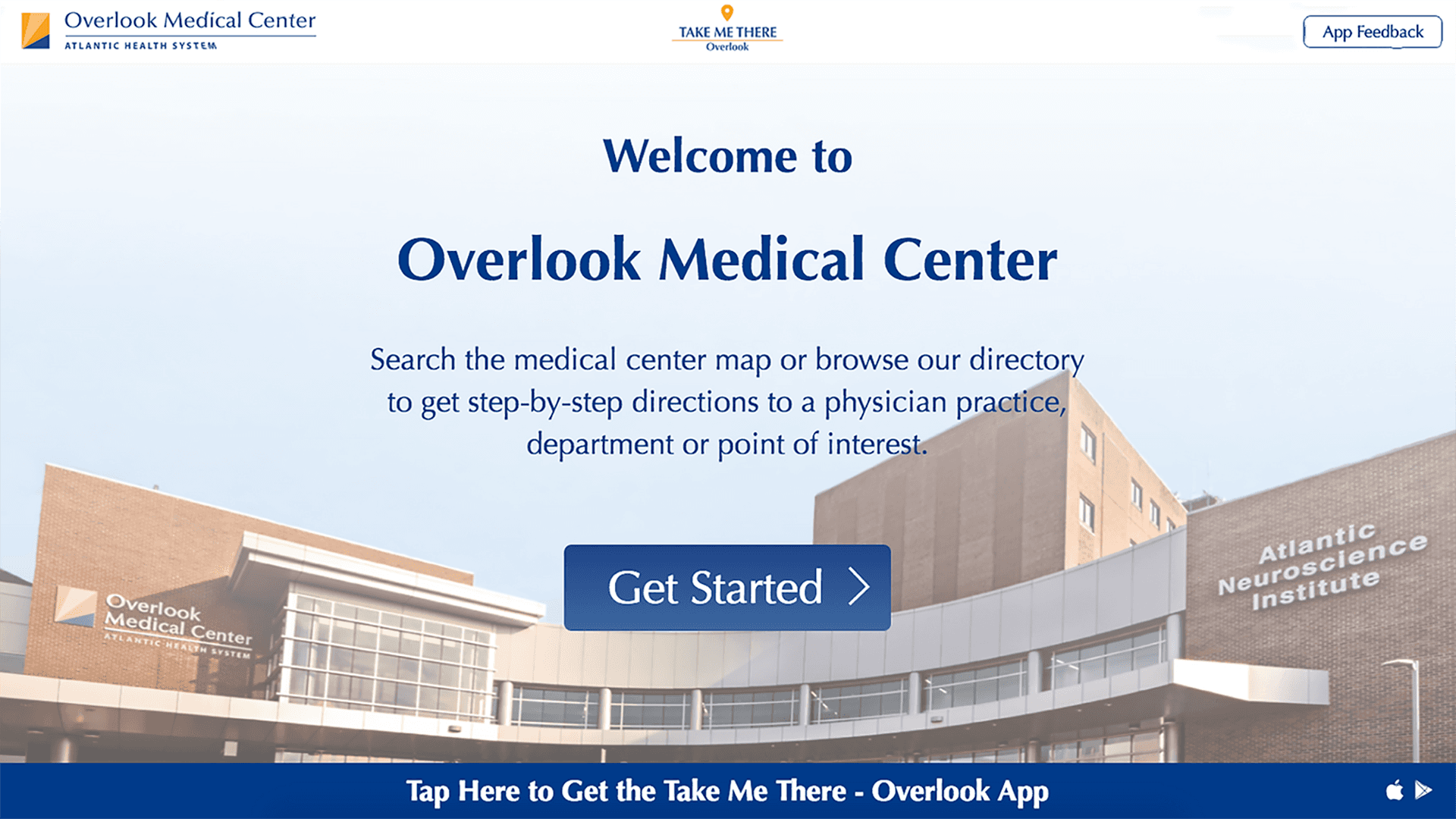
70% of visitors didn't recognize kiosks as interactive touchpoints. The text-heavy, notification-style interface created a passive display rather than inviting interaction. Users needed immediate spatial context to understand both their location and the system's purpose.
Solution:
Replaced text-heavy entrance with prominent, interactive map.
Added clear touch interaction cues
Integrated obvious search and directory options
Included visible mobile app download option
Before:
Original text-heavy, notification-style home screen
After:
New map-centered interface with clear interaction points
Search
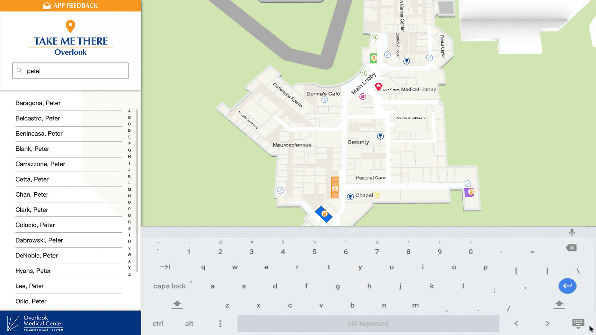
Users lost crucial spatial context when taken to separate search screens. Each screen transition increased cognitive load and decreased confidence in the navigation process.
Solution:
Maintained persistent map visibility during search.
Implemented real-time location preview.
Reduced required taps for common actions.
Added visual location markers.
Simplified search interface while maintaining functionality.
Before:
Original separate search page with wasted space
After:
New integrated search with persistent map view
Location Preview
Complex location information and unnecessary options created decision paralysis. Users needed clear, focused information about their destination with obvious next steps.
Solution:
Defaulted to zoomed-in location view.
Removed non-essential buttons and information.
Streamlined destination-setting process.
Improved hierarchy of next-step options.
Added visual emphasis on location context.
Before:
Original cluttered location information screen
After:
New simplified location preview with clear actions
Route Visualization
Traditional routing instructions overwhelmed users, particularly those under stress or with cognitive challenges. Visual cues proved more effective than text-heavy directions.
Solution:
Simplified routing step descriptions.
Added visual prompts directly on map.
Reduced unnecessary UI elements.
Enhanced contrast for better readability.
Implemented clear progress indicators.
Before:
Original complex routing interface
After:
New streamlined routing with map prompts
Results
Estimated $3.5M annual savings in recovered efficiency. 40% reduction in direction-related staff interruptions.
40% rise in the number visitors approaching the kiosks.
92% first-time user success rate.
50% increase in mobile app adoption via kiosk QR codes.
Reflection
Future Opportunities
Personalized routes based on mobility needs.
Integration with appointment scheduling systems.
Machine learning for crowd management and route optimization.


