Paramount Trends Tool
Data Visualization
Our Self Serve Research tool provides Paramount's sales teams with quick, easy access to television performance metrics across all broadcast & cable networks, delivering valuable insights for users of all data literacy levels.
Sales teams depend on this data to build compelling stories for our clients.
Company
Paramount
Objective
Empower sales teams to identify trends in data and reduce their reliance on the research team for custom data requests
My Role
Product Designer responsible for UX research, ideation, wireframing, prototyping & testing
Timeline
Jan - Feb 2023
Problem
Our sales team, who often lacked experience with large datasets, struggled to find relevant data insights independently. The existing tool required users to run multiple reports to compare data over time, making it time-consuming and inefficient.
This process also placed a significant burden on the research team, who frequently handled custom data requests from sales. The challenge was to create a feature that allowed sales teams to visualize trends quickly, without overwhelming them with complexity, while freeing up research team resources.
Design Process
Methodology: Lean UX (adapted for an agile team).
Research: I interviewed both sales and research teams to understand user needs and gathered quantitative data via surveys. I performed a competitive analysis to see how other tools handled similar data visualization.
Ideation: Collaborated closely with my PM and engineers to find an efficient, user-friendly solution that balanced simplicity and functionality.
Prototyping: Created wireframes and a functional prototype, testing the designs with key users and stakeholders. I focused on clear terminology and simple messaging to ensure the tool met the needs of the sales team.
Testing: Conducted usability tests to refine the design, gathering direct feedback from users, which
confirmed that a simplified interface with a “run” button for generating reports would best suit their needs.
Tools Used: Figma, Figjam, Dovetail, Useberry and competitive analysis techniques.
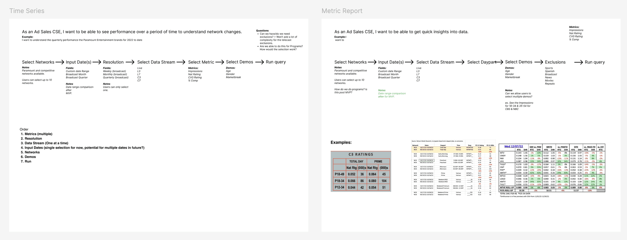
User Journeys
Challenges & Solutions
Challenge: Visualizing large data sets clearly and concisely for non-technical users.
Solution: We limited the visualization to the top 10 results per data run, allowing users to access high-level insights without cluttering the view.Challenge: Existing flow automatically ran reports on any input change, leading to frustrating delays with large data sets.
Solution: Designed a flow where reports generated only after users clicked a “run” button, reducing lag and giving users control over the process.Challenge: Balancing diverse opinions across teams while managing multiple projects.
Solution: I used clear communication and prioritization to ensure alignment and keep all projects on track.
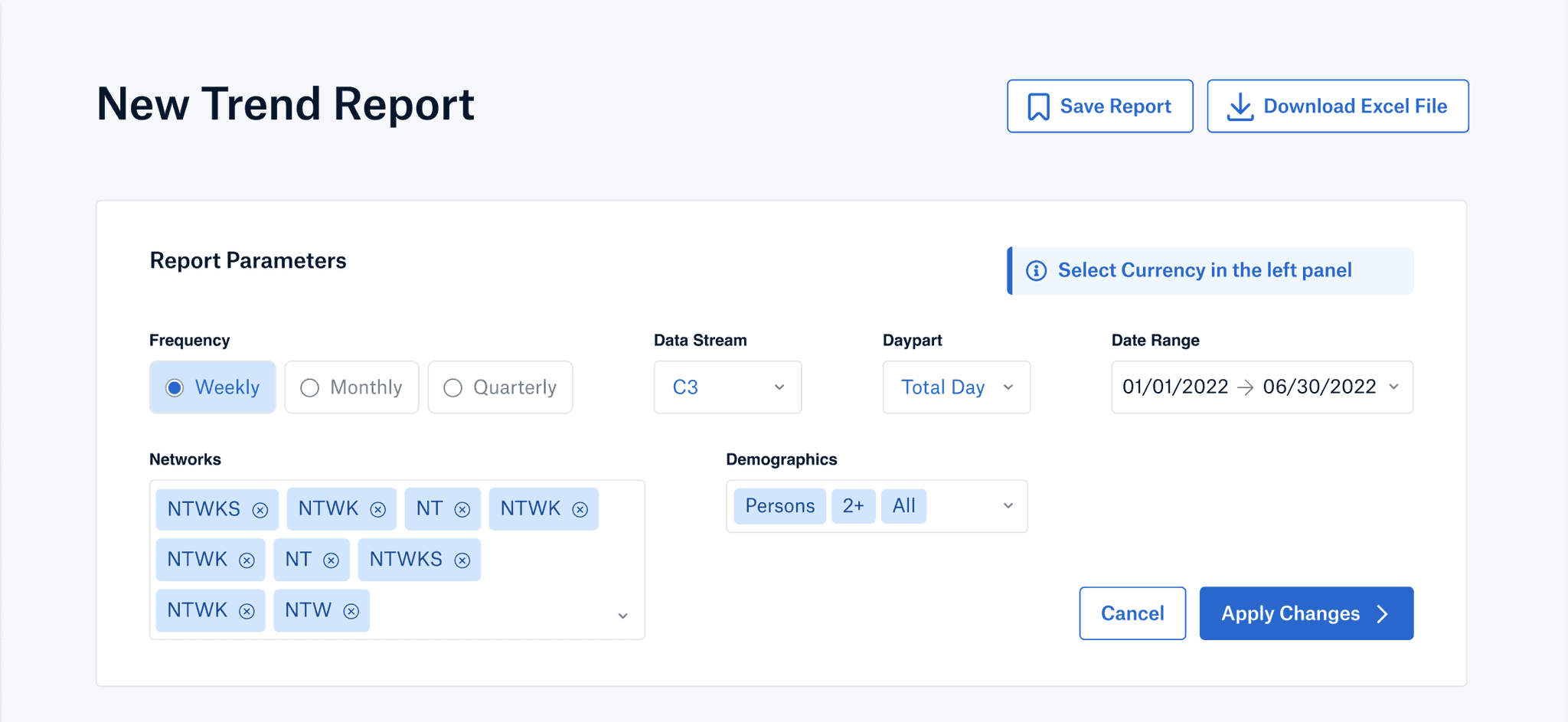
Design
Results
The feature launched successfully, and user feedback was overwhelmingly positive.
Freed up +10% of research team time.
Tool usage increased by 12% post-launch.
Users appreciated the “run” button so much that they requested it be applied across other parts of the tool.
Reflection
Key Learnings:
Conducting research and gathering feedback for one feature can reveal broader insights for overall tool improvements.
Prioritization and communication are critical when balancing multiple projects and stakeholder opinions.
What I'd Do Differently:
Engage Stakeholders Early in Prototyping: Involving stakeholders from the sales team sooner could have streamlined alignment and accelerated decision-making.
Experiment with More Data Visualization Options: Testing additional visualization methods, like heatmaps or trend indicators, may have yielded alternative ways to simplify complex data sets.
Set Up Continuous Feedback Post-Launch: Implementing a feedback mechanism could help track ongoing user satisfaction and identify future improvements.


